Wordmark design
The wordmark was designed to feel calm, grounded, and trustworthy. Soft letterforms and balanced spacing communicate professionalism while remaining warm and approachable.
Thana Guidance offers specialized therapeutic support and personal growth guidance for individuals seeking clarity, resilience, and wellbeing. With a foundation in empathy and professional care, the brand helps clients navigate emotional challenges with confidence and compassion.
Before working with us, the business lacked a cohesive identity that reflected the depth and sincerity of their services.

Thana reached out after previous negative experiences with logo designers who didn’t capture the essence of her vision. She knew the value of her work, but her visual identity wasn’t communicating it.
After seeing our work, she trusted us to get it right, and was willing to invest in a premium solution that genuinely reflected her offering.
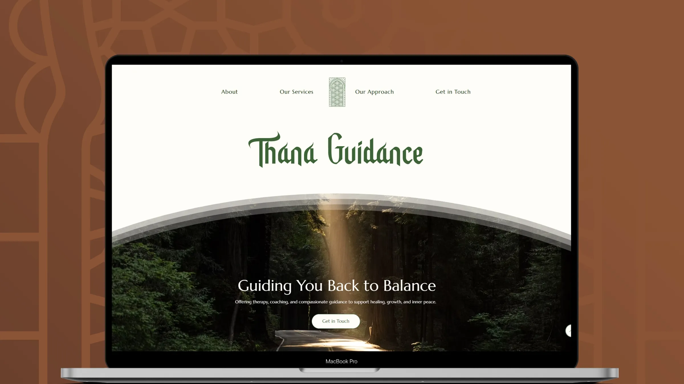
A few weeks after completing the brand identity, she returned to us to build her website, creating a consistent and authentic online presence that supports her mission.
Thana Guidance’s services are deeply personal and rooted in trust, yet the brand lacked visual clarity and resonance.
The challenge was to create a brand and digital presence that felt authentic, welcoming, and credible, all while expressing professionalism and emotional depth.
We approached Thana Guidance as a purpose-driven brand with real human impact. Our strategy was to:
We delivered a cohesive visual identity and digital experience that reinforces Thana’s mission.
The wordmark was designed to feel calm, grounded, and trustworthy. Soft letterforms and balanced spacing communicate professionalism while remaining warm and approachable.
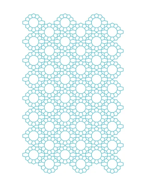
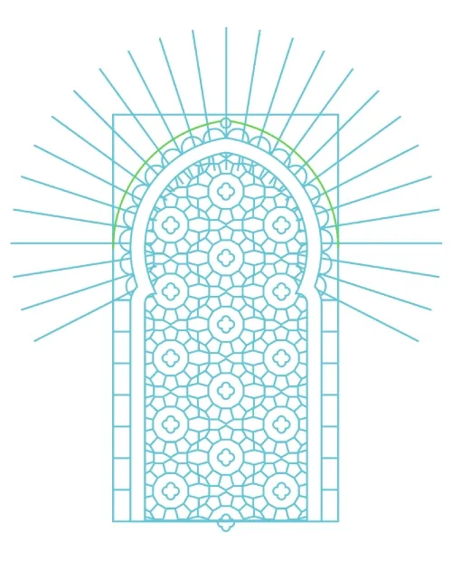
The logomark was created as a symbolic element representing guidance, protection, and inner balance. Its structured geometry adds a sense of stability, while the detailing reflects depth and care.
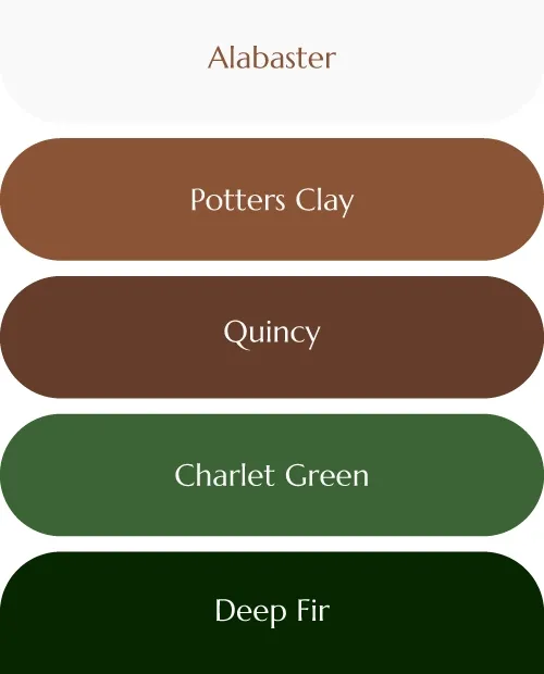
The color palette was developed to evoke calm, reassurance, and emotional safety. Earthy tones paired with deep greens create a grounded, soothing visual language that supports trust and reflection.
We developed a flexible logo suite to support different contexts without losing consistency. This allows the brand to adapt across digital platforms, printed materials, and visual storytelling touchpoints.
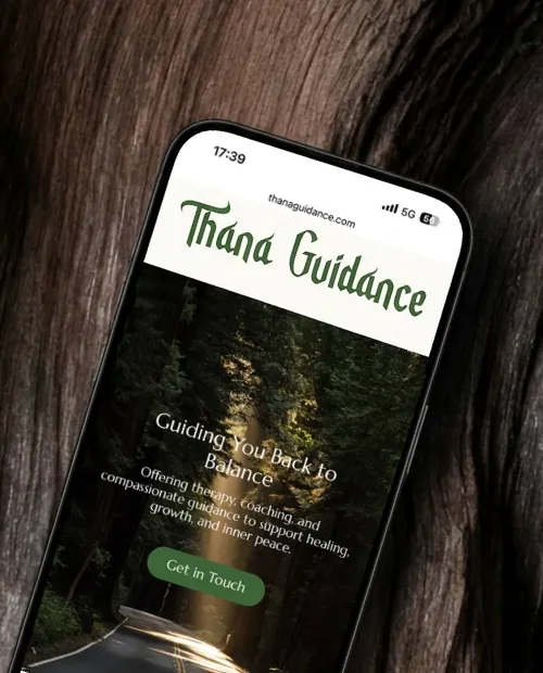
The website was designed with clarity and emotional ease in mind. A calm visual flow, clear messaging, and mobile-first structure help visitors quickly understand the services and feel comfortable reaching out.
If your business lacks a memorable brand identity, we help turn it into one people trust.
Real businesses. Real challenges. Strategic branding decisions that led to clarity, trust, and growth.

Custom apparel & embroidery - USA
Built a complete brand identity and e-commerce website to support recognition, scalability, and long-term growth.
Read case study
Luxury Event Design - USA
Separated their most successful offering into a standalone brand with a clear identity, positioning, and website built to support premium growth.
Read case study
Bespoke furniture & interiors - United Kingdom
Redesigned the brand identity to reflect the quality, professionalism, and premium nature of their bespoke interiors and furniture.
Read case study
Industrial Equipment Hire - Australia
Built a strong, industrial brand system from the ground up to support equipment hire and sales beyond the mining sector.
Read case study